⚛️ Introducing Atomic Design in Vue.js 🔥
Enhance Your Vue.js Projects: Simplify UI Design with Atomic Concepts for Better Flexibility
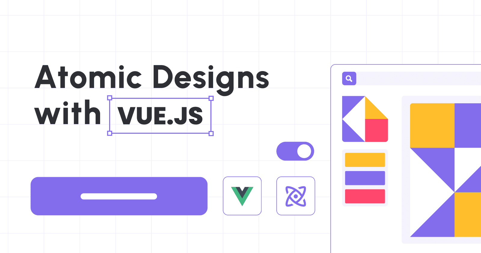
In my experience of building and delivering systems for various clients, depending on their requirements or preferences, it’s inevitable that I may use UI frameworks and libraries like Ant Design and Tailwind. Often, I have to build on top of each components. If you are working alone, it’s not such a big problem. But when working as a team, things get complicated quickly.
So, I started looking at different methodologies which can provide development flexibility and system maintainability for the projects I’m leading. I choose Atomic Design methodology and want to share why it works for me.

Atomic Design is a methodology for creating design systems that breaks down user interfaces into small, reusable components, namely:
Atoms
Molecules
Organisms
Templates
Pages
By following a modular approach to design, atomic design helps teams to create consistent, scalable, and maintainable UIs.
In this post, for simplicity, we'll explore how to implement Atomic Design in Vue.js with only HTML. I'll start with the basics of Atomic Design and then demonstrate how to apply its principles in Vue.js.
At the end of the article, you will get a page that consists of a header, a form and a footer. You can use the example here to apply to any UI framework.

You may notice that each component has borders around it. This is intentional so you can identify whether it's an atom, a molecule, or an organism.
Vue-PDF-Viewer: A Versatile and Powerful PDF Solution for Vue.js
Here’s a little background on what I’ve been working on—Vue PDF Viewer. This library makes it easy to render PDF documents right within your Vue or Nuxt applications, allowing users to interact with PDFs directly on your site. With features like theme customization, built-in localization, and responsive design, it’s crafted to offer a flexible and seamless user experience tailored to your project’s needs.
If you find this helpful, I’d love for you to check out Vue PDF Viewer. Your support inspires me to keep creating and improving tools for the developer community!
Anatomy of Atomic Design
Atomic Design consists of five levels that represent the building blocks of UIs. For this example, I have created an inverted tree structure to visualizing how each anatomy is connected.
- Page
 - Full Layout Template
  - Header Organism
    - Logo Atom
    - Search Form Molecule
      - TextBox Atom
      - Button Atom
  - Content Organsim
    - Form Molecule
      - 2x TextBox Atoms
      - Button Atom
  - Footer Organism
    - Copyright Atom
    - Subscribe Form Molecule
      - TextBox Atom
      - Button Atom
1. Atoms
Atoms are the smallest units of UI that cannot be broken down further without losing their meaning. Examples of atoms include icons, buttons, labels, inputs, and typography.
In Vue.js, atoms can be created as reusable components that accept props to customize their appearance and behavior. For this instance, we have a few atoms to prepare for:
Textbox

<template>
<div class="component-wrapper" data-name="textBoxAtom">
  <label>{{ label }}: <input type="text" :placeholder="placeHolder" /></label>
</div>
</template>

<script>
export default {
  name: 'TextBoxAtom',
  props: {
    label: {
      type: String,
      default: 'labelName'
    },
    placeHolder: String,
  },
};
</script>
<style scoped>
  input{
      padding: 0.75em 2em;
  }
</style>
Button

<template>
 <div class="component-wrapper" data-name="buttonAtom">
  <button :disabled="disabled">
    <slot>Button</slot>
  </button>
 </div>
</template>

<script>
export default {
  name: 'ButtonAtom',
  props: {
    type: String,
    size: String,
    disabled: Boolean,
  },
};
</script>
<style scoped>
button {
  color: #4fc08d;
}
button {
  background: none;
  border: solid 1px;
  border-radius: 2em;
  font: inherit;
  padding: 0.5em 2em;
}
</style>
Logo

<template>
  <div class="component-wrapper" data-name="logoAtom">
    <img :src="computedImageUrl" alt="logo"/>
  </div>
</template>

<script>
export default {
  props: {
    width: {
      type: Number,
      default: 50
    },
    height: {
      type: Number,
      default: 50
    }
  },
  computed: {
    computedImageUrl() {
      return `https://picsum.photos/${this.width}/${this.height}`
    }
  }
};
</script>
For a closer look, you can check out the codes in the Atoms collection.
2. Molecules
Molecules are combinations of two or more atoms that work together to perform a specific function. In Vue.js, molecules can be created by composing atoms as child components within a parent component. Examples of molecules include forms, search bars, navigation menus, and cards.
Referring to the example above, we will need to combine the atoms to create the following molecules:
Subscribe Form Molecule

<template>
<form class="component-wrapper" data-name="subscribeFormMolecules">
<TextboxAtom label="Email" />
<ButtonAtom>Subscribe</ButtonAtom>
</form>
</template>
<script>
import TextboxAtom from "https://codepen.io/9haroon/pen/LYXgdKg.js";
import ButtonAtom from "https://codepen.io/9haroon/pen/BaGqrJg.js";
export default {
components: { ButtonAtom, TextboxAtom }
};
</script>
<style scoped>
form {
display: inline-flex;
}
</style>
Search Form Molecule

<template>
  <form class="component-wrapper" data-name="searchFormMolecules">
    <InputAtom label="Search" />
    <ButtonAtom>Search</ButtonAtom>
  </form>
</template>

<script>
import InputAtom from "https://codepen.io/9haroon/pen/LYXgdKg.js";
import ButtonAtom from "https://codepen.io/9haroon/pen/BaGqrJg.js";
export default {
  components: { ButtonAtom, InputAtom }
};
</script>
<style scoped>
form {
  display: inline-flex;
}
</style>
Form Molecule

<template>
  <div class="form-molecule component-wrapper" data-name="formMolecules">
    <div><InputAtom :label="nameLabel" :placeholder="namePlaceholder" /></div>
    <div><InputAtom :label="emailLabel" :placeholder="emailPlaceholder" /></div>
    <p>
      <ButtonAtom :disabled="isSubmitDisabled">
        {{ submitLabel || "Button" }}
      </ButtonAtom>
    </p>
  </div>
</template>

<script>
import InputAtom from "https://codepen.io/9haroon/pen/LYXgdKg.js";
import ButtonAtom from "https://codepen.io/9haroon/pen/BaGqrJg.js";
export default {
  name: "FormMolecule",
  components: {
    InputAtom,
    ButtonAtom
  },
  props: {
    nameLabel: String,
    namePlaceholder: String,
    emailLabel: String,
    emailPlaceholder: String,
    submitLabel: String,
    isSubmitDisabled: Boolean
  }
};
</script>
You can find the codes in the Molecules collection.
3. Organisms
Organisms are combinations of molecules that form distinct sections of a UI, such as headers, footers, sidebars, and content blocks. In Vue.js, organisms can be created by composing molecules as child components within a layout component.
For this exercise, three organisms are needed.
Header Organism

<template>
  <header class="component-wrapper" data-name="headerOrganism">
    <LogoAtom width="60" />
    <SearchFormMoecules />
  </header>
</template>

<script>
import SearchFormMoecules from "https://codepen.io/9haroon/pen/zYMmjqa.js";
import LogoAtom from "https://codepen.io/9haroon/pen/xxQMbeJ.js";
export default {
  components: { SearchFormMoecules, LogoAtom }
};
</script>
<style scoped>
header {
  min-height: 50px;
  display: flex;
  justify-content: space-between;
  align-items: center;
}
</style>
Content Organism

<template>
  <div class="page-organism">
    <div class="content-wrapper-title">
      <h1><slot name="title">Here might be a page title</slot></h1>
      <p><slot name="description">Here might be a page description</slot></p>
    </div>
    <slot>...</slot>
    <!--   This might includes some molecules or atoms   -->
  </div>
</template>
<script>
export default {
  name: "ContentOrganism",
  components: {}
};
</script>
<style scoped>
.page-organism {
  padding-top: 50px;
  padding-bottom: 80px;
  box-shadow: inset 0px 10px 15px -3px rgba(0, 0, 0, 0.1);
}
.content-wrapper-title {
  text-align: center;
}
</style>
Footer Organism

<template>
  <footer class="component-wrapper" data-name="footerOrganism">
    <CopyrightAtom />
    <SubscribeFormMoecules />
  </footer>
</template>

<script>
import SubscribeFormMoecules from "https://codepen.io/9haroon/pen/ExOrarL.js";
import LogoAtom from "https://codepen.io/9haroon/pen/xxQMbeJ.js";
import CopyrightAtom from "https://codepen.io/9haroon/pen/gOQqOBj.js";
export default {
  components: { SubscribeFormMoecules, LogoAtom, CopyrightAtom }
};
</script>
<style scoped>
footer {
  display: flex;
  justify-content: space-between;
  align-items: center;
}
</style>
Per usual, here's a collection of organisms' codes that I've created.
4. Templates
Templates are the structures that define the layout and composition of pages by specifying the placement and size of organisms within regions, such as headers, footers, and content areas.
In Vue.js, templates can be created as parent components that accept named slots for child components. Applying the 3 organisms to the Templates concept, here is how it could look like.

<template>
  <div class="full-layout-template">
    <HeaderOrganism />
    <ContentOrganism class="content">
      <template #title>
        <slot name="title">default title</slot>
      </template>
      <template #description>
        <slot name="description">default description</slot>
      </template>
      <slot />
    </ContentOrganism>
    <FooterOrganism class="page-footer" />
  </div>
</template>
<script>
import HeaderOrganism from "https://codepen.io/9haroon/pen/WNYaJGR.js";
import ContentOrganism from "https://codepen.io/9haroon/pen/vYQbOeO.js";
import FooterOrganism from "https://codepen.io/9haroon/pen/RwqvPRN.js";
export default {
  name: "FullLayoutTemplate",
  components: {
    HeaderOrganism,
    ContentOrganism,
    FooterOrganism
  }
};
</script>
<style scoped>
.full-layout-template {
  display: flex;
  flex-direction: column;
  min-height: 90vh;
}
.content {
  flex: 1 0 auto;
}
.page-footer {
  flex-shrink: 0;
}
</style>
here is the CodePen's link of the template
5. Pages
Pages are the final presentation of UIs that combine templates with specific content to form complete views. In Atomic Design, pages are like instances of templates that represent unique experiences for users.
In Vue.js, pages can be created by copying a template and replacing its slots with actual content. Although, in this example, I only change the content of Content Organism, you could choose to change all or no content.

<template>
  <FullLayoutTemplate>
    <template #title>{{ title }}</template>
    <template #description>{{ description }}</template>
    <div class="fixed-width">
      <FormMolecule nameLabel="Name" emailLabel="Email" submitLabel="Save" />
    </div>
  </FullLayoutTemplate>
</template>
<script>
import FullLayoutTemplate from "https://codepen.io/9haroon/pen/GRwzpxx.js";
import FormMolecule from "https://codepen.io/9haroon/pen/PoxyRMo.js";
export default {
  name: "HomePage",
  components: {
    FullLayoutTemplate,
    FormMolecule
  },
  data() {
    return {
      title: "Welcome to my example",
      description: "This is an example of Atomic Design in Vue.js",
      copyright: "Copyright © 2023"
    };
  }
};
</script>
<style scoped>
* {
  font-family: Avenir, Helvetica, Arial, sans-serif;
}
.fixed-width {
  max-width: 350px;
  margin: 0 auto;
}
</style>
here is the CodePen's link of the page
Benefits of Atomic Design in Vue.js
By using Atomic Design in Vue.js, you can achieve several benefits, such as:
Consistency: By creating reusable components, you ensure that your UIs look and behave consistently across all pages.
Scalability: By breaking down UIs into small pieces, you can easily add, remove, or update components without affecting other parts of the system.
Maintainability: By organizing components into folders and files, you can easily find, edit, or debug them in isolation from other parts of the system.
Reusability: By creating standalone components, you can reuse them in other projects or share them with the community, thus saving time and effort.
Atomic Design is a powerful methodology that can help you design better UIs in Vue.js. By following its principles, you can create reusable, modular, and scalable components that make your code more maintainable and your users more satisfied. So, go ahead, give it a try, and let me know how it worked for you!

Vue PDF Viewer: A Complete PDF Solution for Vue.js

If you’re looking for a powerful, flexible solution for rendering PDFs directly in your Vue or Nuxt applications, Vue PDF Viewer is the tool for you. Offering a wide array of features—like theme customization, localization support, and responsive layouts—it’s built to handle a range of project requirements while delivering a seamless, user-friendly experience.
If this sounds useful to you, feel free to explore Vue PDF Viewer and see how it can enhance your next project. It would mean the world and encourage me to create more content.
Thank you in advance! 🙏



![🚀 6 Open-Source PDF Viewer and Annotation libraries every Vue developers should know [2025] ✨](/_next/image?url=https%3A%2F%2Fcdn.hashnode.com%2Fres%2Fhashnode%2Fimage%2Fupload%2Fv1756741702837%2F622edba2-1e1b-4f83-938c-032914871d57.png&w=3840&q=75)
